Translating a client’s vision into a practical yet aesthetically pleasing reality requires a meticulous approach. In this article we’re going to delve into two distinct rooms we designed for our clients: A kitchen transformation and a functional home office.
We’ll share the client brief and how we responded to the brief to create the design solution that met their requirements.
Each project we complete focuses on tailored design, blending functionality with sophisticated aesthetics to harmonise with the clients’ lifestyle and preferences.
The Kitchen Renovation
Client Design Brief
The client’s vision for their kitchen was clear: a timeless, modern space that exudes sophistication and maintains a light, airy atmosphere. Here’s a breakdown of their specific requirements and constraints:
- A light and bright kitchen that used clean lines
- Simple and sophisticated with hard wearing, low maintenance materials
- Better use of the space to create a more open feeling.
- Refined, uncluttered and not fussy
- Incorporate textural material into design with the use of timber accents or VJ panelling.
- Incorporate a wine fridge
The restrictions were:
- The client wanted to retain a laundry cupboard that was on the other side of the kitchen, so we could not ‘claim’ and utilise this space in the kitchen (ideally we would have used it for the walk-in pantry).
- We had to work within the current kitchen footprint.
- We were also specifying a new floor and living room cabinetry so needed to ensure all elements worked cohesively together.
Kitchen Design Response
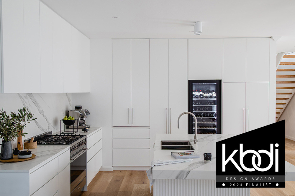
The design response for the kitchen incorporated all the requirements the client requested in their brief by creating a sophisticated kitchen that is clutter and fuss-free, which uses durable and easy-to-clean materials in a simple colour palette, to keep the space light and bright.
This was achieved in many ways, however, the change with the biggest impact was redesigning the existing 3-sided island bench to a lineal style with a breakfast bar, which allowed for large drawers and improved connectivity to the dining space.
Drawers were added wherever possible with the dimensions of these designed around the clients’ appliances and storage needs, to replace cupboards and small pokey drawers.
The challenge of designing a kitchen with no windows meant the right material choice was imperative to reflect and maximise light.
A simple material and colour palette were used to create a sophisticated space, working off the premise of ‘less is more’. Dekton were used for the benchtop and splashback for a seamless flow, with white cabinetry to achieve the light and bright feeling desired.
Texture was added with the specification of panelled cabinetry for the front of the island bench in the same material as the cabinetry.
The challenge was creating good pantry storage to replace a poorly designed pantry cupboard, so a Space Tower pantry was utilised to maximise storage in a tight space.
An integrated fridge and freezer were suggested to make for a seamless and clutter free aesthetic coupled with a back lit wine fridge as a feature in the space, as the clients are lovers of fine wine.
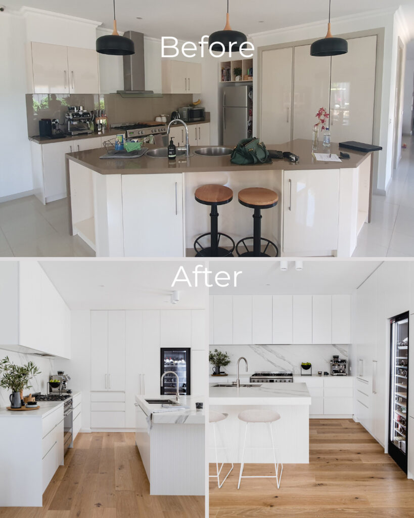
The clinical and dated 90‘s kitchen with poor storage solutions was replaced with a well thought out design that maximised storage and was designed around the clients storage, functionality and aesthetic requirements making for a simple yet effective design.
The Home Office Transformation
Client Design Brief
For the home office, the focus was on creating a functional yet stylish home office environment for two people, and to create good storage solutions.
The clients specific requirements were:
- Utilise light-coloured cabinetry to make the room light and bright.
- Ensure room has warmth and doesn’t look clinical.
- Update the window treatments to be sophisticated, and to create privacy, yet allow natural light in.
- Create a functional cabinetry design to maximise storage that also allows for the ability to display decorative items.
- Design the desk space for two people to work comfortably
The restrictions were:
- The window took up most of the wall, leaving only a small space on either side, which didn’t allow for cabinetry to run the whole length of the wall.
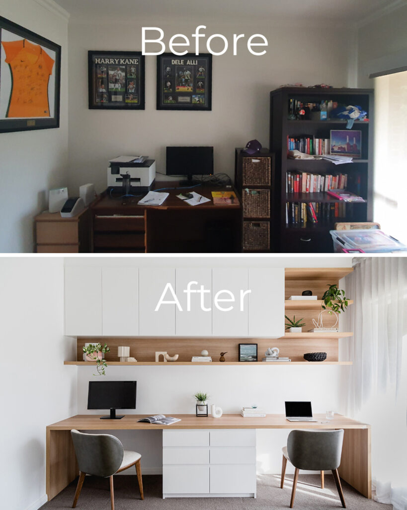
Study Room Design Response
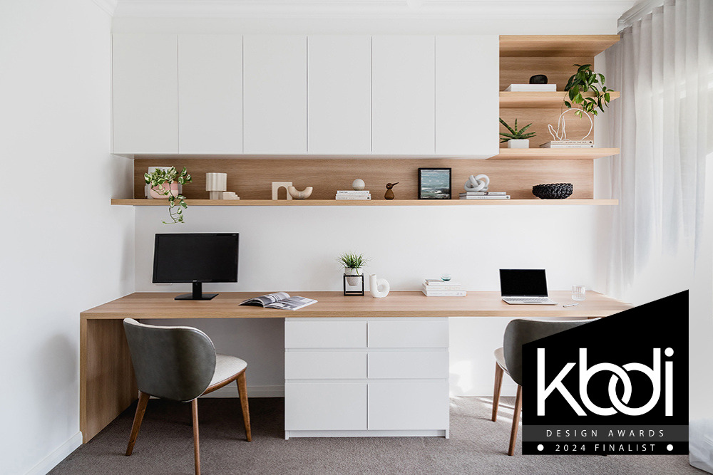
The design response for the study incorporates all the requirements the client requested in their brief by creating a sophisticated home office space generous enough for two people working from home, while also creating a clutter and fuss-free environment that links to the overarching aesthetic in the home of a light and airy space.
The two hard materials used reference a simple, yet sophisticated colour palette, working off the premise of ‘less is more’. This creates a light and bright space that is also warm and inviting with the use of timber, coupled with the sheer curtains that soften the space, while also creating privacy and allowing natural light into the room.
The key design challenge was overcoming the short wall length on the left side of the window, which was not wide enough for cabinetry to run the length of the wall. Further, it did not allow for a practical desktop width wide enough for two home office spaces. To overcome this, sheer curtains that ran the length of the window wall, were cleverly specified to disguise the narrow wall on either side of the window, which provided a beautiful aesthetic, while also creating a conscious design decision for a 600mm desktop to run up to the sheers, rather than the wall (which was not possible anyway).
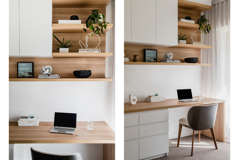
The breath of the desktop allows for plenty of room for each person, while a double bank of ‘his’ and ‘hers’ drawers acts as a demarcation between the spaces and provides practical desk storage for smaller items to keep the desktop free from clutter.
The white overhead cupboards blend into the wall for a seamless look, while functionally providing deep and high storage for lever arch files, which the client uses regularly. These are easily accessible, yet are hidden from view behind the cabinetry doors, to again provide for a clean and uncluttered aesthetic.
The use of timber as an accent for the shelving allows for a warm background to display decorative items, particularly with the open shelves overhead that connect to the shelf under the overhead cupboards. This provides for a more sophisticated design solution rather than a wall of overhead cupboards and, therefore is less clinical. Additionally, the timber shelves also create a connection with the cabinetry of the desktop.
Overall, the design is a practical solution that heavily focuses on the functionality required by the clients. The materials chosen coordinate with other materials and elements used elsewhere in the home to create a cohesive aesthetic, while also being practical, easy to clean and providing for a simple and effective, light and airy space.
From reimagining a kitchen into a modern culinary haven to creating a serene home office environment, we are very proud of our attention to detail and collaborative approach which are evident throughout. This project not only met but exceeded the clients’ expectations.
This is what the client had to say:
“Frances Cosway and the White Pebble Interiors team were outstanding in all aspects. They nailed the brief, were so easy to work with, not afraid to challenge our thinking and were so professional and helpful in every aspect! We love our renovations. We are very proud of our “new” home and we were both grateful and thankful for all that Frances did”. – Larinda & Russel
The high standard of our design work is further validated by the fact that both the kitchen and the study were nominated as Finalists in the KBDi Designer Awards 2024, underscoring the exceptional quality and impact of these projects.